
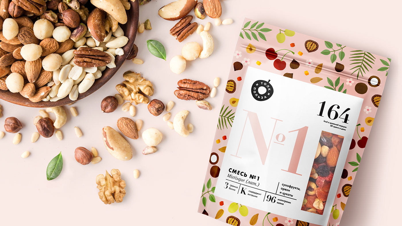
HEALTHY LIFESTYLE FORMULA
Informative and concise. Affordable and aesthetically pleasing. Strictly and gently. This concept reflects the trend towards informative, infographic design in healthy nutrition.
The nut becomes one of the important elements of the healthy human nutrition system. We give a summary of the necessary and interesting information to the consumer in the form of a table of healthy elements.
Each element is designated by two letters from it's name in Russian, Gr as Gretskiy (walnut), Fi as Finiki (dates), etc.
Seeing several products in front of him, the consumer can draw up the ideal formula for his diet.


THANKS FOR WATCHING!
Client: Tolk I Polza
Graphic Design / Art Direction: Tatiana Zabelina


